the simplicity of a fractal
An interface suffices whenever the underlying details become textural; we know they exist, but wouldn't notice if they changed.
Previously, we've looked at code generation in both Rails and Thrift. But unlike Thrift, the code generated by Rails is meant to be changed. Any change is fine, so long as it's not too surprising; the only limit is our judgement.
Rails, then, doesn't fit the limb-metaphor. Our explanation will not always end with the model. Even so, the model remains a locus; for many, it suffices. The only thing users need to know about a CRUD app are the entities.1
And this is all we want from an interface. It doesn't need to be impermeable, it just needs to suffice for a reasonable number of people. An interface suffices whenever the underlying details become textural; we know they exist, but wouldn't notice if they changed.
This phenomenon is self-similar; every component, at every level, will have its own texture.2 Our software, in other words, resembles fractal geometry.
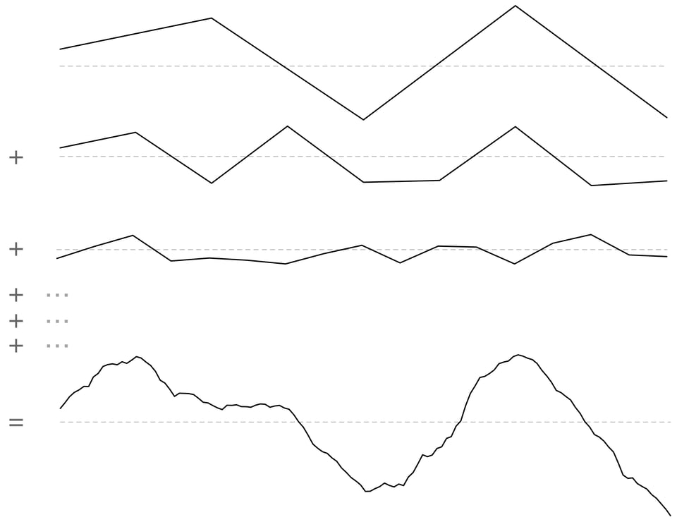
It's easy to create fractal geometry. Generate a small number of random values within [-0.5, 0.5]. Then generate twice as many values at half the amplitude, and repeat:

The sum of these octaves is a fractal curve. Here, the final result is comprised of six octaves. The effect of the last four octaves, however, is fairly subtle:

After a handful of octaves, it's all texture. And once we hit that threshold, we can stop. We can be confident there are no hidden surprises. This is an ideal to which we can all aspire.
But software is understood one piece at a time. And each piece is contiguous with others. A commonsense compression scheme would preserve nearby details, and elide everything else:

This is a common strategy in video game engines. When the player is far away from an object, the game will render a less-detailed version. Smaller and less significant objects may be skipped over entirely.3
As the player moves, the elided details are reintroduced. When done poorly, this can be very distracting. Imagine walking across a flat, grassy meadow. Suddenly, something appears in the middle distance. Is it important? Dangerous? No, it's just a tree.
This is bad design. The tree is significant; it belongs to the higher octaves.4 It should be visible at a distance. In an open space, new details should be barely noticeable. In the fractal-metaphor, simplicity means gradual surprise.
It's common, when discussing software abstractions, to use a container-metaphor. The interface contains, and obscures, the underlying implementation. And when we open the container, everything is revealed at once; there is a sudden spike of surprise.
But the usefulness of of the container-metaphor is short-lived; the surprise doesn't last. The next time, we know what to expect. When we read familiar code, we are just reacquainting ourselves with the finer details.
And so, when reasoning about familiar code, we should prefer the fractal-metaphor. Our layered abstractions are not containers, but octaves. The higher octaves should be memorable, and the lower octaves easy to page into memory. Even sprawling code can be simple; it just needs to be explained one step at a time.
-
This phenomenon is both explored and generalized in Daniel Jackson's The Essence of Software. ↩
-
Even if our software is designed to run on specific hardware, it isn't designed to run on a specific chunk of silicon. ↩
-
This isn't only for performance reasons. Details smaller than a single pixel can lead to Moiré patterns and other visual artifacts. ↩
-
Within this metaphor, "high" octaves are the high-level octaves, not the high-frequency octaves. ↩
Add a comment: